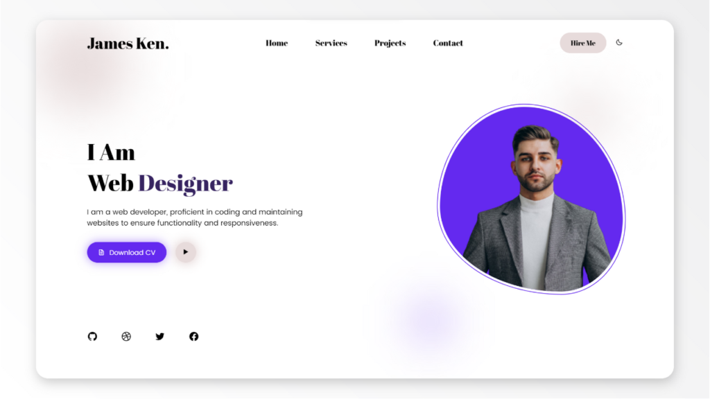
In this tutorial, you will learn how to make a portfolio website using HTML, CSS and JavaScript. A portfolio website is a personal website that showcases your skills, projects, and achievements.
It is a great way to demonstrate your work to potential employers, clients, or collaborators, so it should be well designed. You will use HTML to create the structure of the website, CSS to style the elements and add animations, and JavaScript to add some interactivity and functionality to the website.
By the end of this tutorial, you will have a responsive and portfolio website that you can customize and update with your own content.
The tutorial could be divided into the following steps:
1. Creating HTML Structure
You will need to create a main container element that will hold the website sections, such as the header, the introduction, the skills, the projects, the contact, and the footer. You will also need to create some semantic elements, such as nav, section, article, and aside, to organize the content and make it more accessible. You will use some HTML attributes and classes to identify the elements and make them easier to style and manipulate later.
2. Styling With CSS
Style the website elements using CSS. You will use CSS to add colors, fonts, backgrounds, borders, shadows, and other styles to the website elements. You will also use CSS to position and align the elements using flexbox and other techniques. You will also use CSS to create some basic animations, such as changing the color or opacity of the elements on hover.
3. Adding JavaScript
Add interactivity to the website using JavaScript. You will use JavaScript to add some logic and functionality to the website, such as creating a responsive navigation menu and a dark mode button. You will also use JavaScript to add some event listeners to the website elements, such as click, and execute some functions or actions based on the events.
4. Making the Website Responsive
Make the website responsive using CSS. You will use CSS to make the website adapt to different screen sizes and devices, such as mobile phones, tablets, or desktops. You will use some CSS techniques, such as media queries, breakpoints, relative units, or responsive images, to make the website responsive and user-friendly.
HTML Starting Point
<!DOCTYPE html>
<html lang="en">
<head>
    <meta charset="UTF-8">
    <meta name="viewport" content="width=device-width, initial-scale=1.0">
    <title>Portfolio | ludiflex</title>
    <!-- IMPORT BOXICONS -->
    <link rel="stylesheet" href="https://cdn.jsdelivr.net/npm/boxicons@latest/css/boxicons.min.css">
    <link rel="stylesheet" href="assets/css/style.css">
</head>
<body>
    <!-- WRAPPER FOR BLUR BACKGROUND -->

    <!-- HEADER SECTION -->

    <!-- HERO SECTION -->

    <script src="assets/js/main.js"></script>
</body>
</html>
CSS Starting Point
/* ABRI FATFACE FONT */
@import url('https://fonts.googleapis.com/css2?family=Abril+Fatface&display=swap');

/* POPPINS FONT */
@import url('https://fonts.googleapis.com/css2?family=Poppins:wght@400;500;600;700&display=swap');

*{
    margin: 0;
    padding: 0;
    box-sizing: border-box;
}


/* ===== COLOR VARIABLES ===== */
:root{
    --first-color: #6429EF;
    --second-color: #E7DBDB;
    --third-color: #FFFFFF;
    --black-color: #000000;
    --dark-blue: #372461;
    --bg-color: #FFFFFF;
    --blur-element-color: #E7DBDB;
    --shadow-1: 0 0 20px 5px rgb(101, 41, 240, 0.5);
    --shadow-2: 0 0 20px 5px rgb(232, 219, 219);
}
/* ===== DARK MODE COLOR VARIABLES ===== */


/* ===== Blur Background ===== */


/* ===== Header - Navigation Bar ===== */


/* ===== Hero section ===== */


/* ====== Hero Image section ===== */


/* ===== Animations ==== */


/* ===== Responsive Design ===== */
JavaScript Starting Point
const menuToggle = document.querySelector(".menu-toggle");
const navMenu = document.querySelector(".nav_menu");
const darkModeToggle = document.querySelector(".dark-mode-toggle");
Download Assets from the link down below:

